
The Multiple Sides of Friction: The Good, the Bad, and the How to Use it
Written by Caroline SindersThis Digital Money Blog is contributed by an independent guest author. The views and opinions expressed are solely those of the author and may not necessarily reflect the official policies of Interledger Foundation.
In a previous post, I touched briefly on the role of friction in design, which I will expand upon here. Friction is an incredibly important design element; it’s often the ying to ‘flow’s yang. Flow is key to engaging a user in an app or product, where the user has deep focus and enjoyment while interacting with the app, product, or technology. In a flow state, nothing is impeding a user in what they are doing, but the design is encouraging the user's flow state. Friction is its literal opposite, where design is slowing the user down or allowing the user to pause; friction often breaks the flow state. This video with Norman Nielsen Group (the godfathers of modern user experience design) does a great job of explaining the relationship between friction and flow. Friction, in particular, has a bad reputation in design because of how it is often weaponised to harm, trick, and confuse users. Friction, like design, contains multitudes. Design, much like technology, contains multitudes. Design and technology are not neutral; they can be forces for good and forces for harm. Design is an integral part of technology because it can help ensure a user has a clear understanding of what technology is doing, or not doing. Friction is a part of design that helps users build mental models.
Friction as a Design Tool
At first glance, it can seem like a strange thing to label friction as a positive use and force of design. Isn’t slowing down a user while they are engaging with a product a type of action we would want to avoid in technology and product design? The answer is: it depends! It depends on the context of what the product is doing, what the user is doing, and what types of feedback the product/app/technology needs and what types of feedback the user needs. Friction is a key part of this feedback loop. Users need to be able to build mental models of how an app/product/technology is functioning, and the users deserve to have clarity, consent, and understanding in a product; this is where friction is key.
When deployed correctly, friction is a key tool in any design and product toolkit because it can help slow down users, and give users intentional time and space to think, assess, confirm, re-confirm, and more deeply engage with a product, decision making and to avoid errors. Friction is a key design ingredient when designing for consent, and ensuring that the consent is actually meaningful. Practically, friction is necessary as a design pattern for any ‘KYC’ design flow; it’s also something users now expect in a financial app or any app related to medical usage, government usage, etc, especially when identity needs to be confirmed, and that confirmation needs any kind of external verification, including sharing legal documents or private and sensitive information. In this way, ‘friction’ becomes thoughtfully and intentionally designed as multiple steps in this verification and confirmation space.
Friction is also deployed in security contexts, such as entering special codes (like two factor authentication or codes sent via text message or email) to confirm the right user is logging in. This type of verification is a necessary friction focused design pattern, one that can also signal that care and security are being centered in an app, product or service. But these examples of friction in verification and confirmation are also clever and standard ways to deter bad actors who might be trying to compromise a user’s account. These extra safety steps are where friction really shines as this necessary design tool for safety.
Friction also exists outside of heavily regulated fields. Friction, when deployed thoughtfully, becomes a necessary component for slowing down users to encourage reflection, mindfulness or even dissuade harmful behavior. Friction can be key in mitigating harassment such as prompts or nudges that read “are you sure you want to post this” are deployed on social media platforms which cause users to reflect on the content they are about to post. Other examples of friction to encourage mindfulness are examples can be seen on Netflix, where a pause in streaming content occurs after hours continuously and a prompt asks a user if they would like to turn off the show, or if they are still watching. Sometimes the product really wants to confirm and get consent- such as closing a Microsoft word document. A pop up will appear asking for confirmation before allowing the document to close, ensuring this is the action the user wants to do.
In some of my own design work, I have implemented friction as a safety mechanism for researchers. When collaborating with Amnesty International in 2018 on the Troll Patrol and Twitter Toxicity reports, we worked with over 6,500 volunteers to hand-label nearly 300,000 pieces of content from Twitter sent to female journalists and politicians. We needed human volunteers to help appropriately label this content, but because a lot of this content was harmful and violent in nature, I designed in the labeling schema that a notification would appear every five tweets that prompted the volunteer to take a break. This friction was designed to pull the labeler out of their ‘flow’ and slow them down. I’ve worked in human rights and technology-facilitated violence for over 4 years at that point, and I had witnessed how colleagues would develop second-hand trauma from the amount of harmful content they were seeing in their research. This friction was a safety mechanism to ensure that our volunteers could not get into a ‘flow’ or ‘groove’ of working and lose track of time. Even if it meant our work took longer, and individual volunteers did less work on labeling, it was an important safety mechanism to implement, and it was one I saw working in real time!
A classic example that I know the Interledger Community is well aware of is the necessary friction associated with sending money. When sending money, there are often a series of steps of confirmation. When I use my debit card (which is set up through a UK neo-bank) to send money to a saved (and known recipient), I have two screens of confirmation I have to move through. The first screen is where I write out the amount, and I am prompted to write a “reference” to label the payment. I then click “Review Payment” in my app, which sends me to the second screen. The second screen shows me a summary of what I’m about to send, including the recipients name, the amount, the reference, the category (which is payments), some brief text outlining that UK payments are normally instant but can take up to two hours, and then a green bottom at the bottom that says “Make payment.” The app then “thinks” as it’s processing the payment, in which I receive a notification that says I’ve made a payment and I’m sent to a final page that is a summary of the payment information again, now marked as paid. If I were registering a new recipient, I would go through a much longer process with multiple screens first with entering a name, then account numbers, then sending money similar to the above process. Even a product like Venmo has friction. You enter in a screen name or contact information, select the recipient and then you are sent to one screen where you can enter the amount, write a reference and hit pay which sends you to another screen. Similar to my neo-bank debit card example, I see a summary of what I am sending and then confirmation again to hit a button that says “pay.” This might not seem like a lot of friction but it is still friction. The multiple steps of reshowing the same information encourages the user to reflect on and confirm what they are sending and to who.
When Friction Goes Wrong
If friction is so great, how can it go wrong? Well, it goes wrong all the time, either on purpose or by accident. Generally, if friction slows a user down or dissuades them from what they want to do, that will frustrate a user. However, as frustrating as it can be to send money less quickly, most users know that the friction in that design flow exists as a seat belt or safety mechanism. Perhaps a truth soon to be universally acknowledged is that design isn’t always fun when it's there to help. But friction when it unnecessarily slows a user down and adds in arbitrary slowness or decisions that clearly prioritize the company over the user. This differentiation is key – the friction in KYC, security logins or sending money are beneficial to the user because the friction allows for slowness and it’s user centered for the user’s wellbeing, even if it can be annoying. Weaponised friction can be seen in this investigative and interactive article I wrote on harmful design patterns (often called dark patterns). In my article, I explored how different products use harmful design patterns and friction to slow down, confuse and even deter users from unsubscribing. These elements were often specifically inserted in the unsubscribe flow; users wanted to unsubscribe, and often the design was working directly against them like elongating the unsubscribe flow, moving button placements, emphasizing one button over the other, or even hiding unsubscribe buttons. Weaponised friction can be a key in amplifying harmful design patterns, where it can hurt users and lead to confusion, or making it more difficult for the user to navigate a design flow and exercise their own choices and agency.
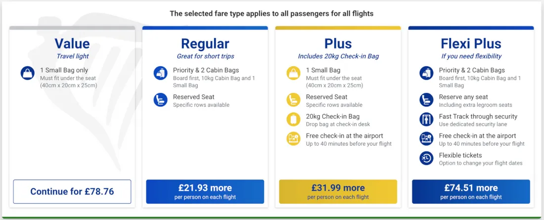
This example from the Dark Patterns Hall of Shame illustrates how Ryanair deploys friction alongside harmful design patterns to confuse users. What Ryanair is doing here is deploying multiple, unnecessary pages that are attempting to upsell a user additional options but it’s often unclear when deployed in upselling unnecessary extras during an elongated process of buying a ticket. Upselling extras isn’t the issue here, it’s that in the design flow to purchase a seat, Ryanair has utilized ‘misdirection’ and insert multiple instances of upselling even when the user has declined the upsells– its this insertion of extra instances of upselling, like speedy boarding, or confusing design around purchasing baggage (making it unclear what is included with a ticket) or other ticket extras, elongates the entire buying process. In this example, the user is both annoyed and confused, as it's unclear what is necessary to purchase for the ticket and what is simply a trick to get more money out of the user.
Using Friction As Innovation
Friction is a key tool, particularly when just the right amount of friction is deployed. It’s figuring out the right amount of friction to balance a user’s needs and desires, alongside safety and consent. It is doable, and when deployed correctly, it’s a wonderful pro-user tool to have. As technologists and a community interested in digital financial inclusion, the projects and products we build often establish new design patterns, but we are at a nexus point as a community of practitioners. We have the ability to enhance technology, improve usability, and reach new customers and communities who deserve to be banked, to be in control of their finances, and to have financial service products and platforms work for them, not against them. Friction is a key tool we can use to ensure our users understand what we are building, how it serves them, and how to allow for their agency and safety simultaneously. Agency shouldn’t come at the cost of security or understanding. Small design tweaks that center on user needs and slow users down (but not too much), especially when sending money, are key to financial inclusion.

Caroline Sinders is an Interledger Foundation Ambassador and an award winning critical designer, researcher, and artist. They’re the co-founder and executive director human rights research and technology lab, Convocation Research + Design. They’ve worked with the United Nations, Tate Exchange at the Tate Modern, the United Nations, Ars Electronica’s AI Lab, The Information Commissioner's Office, the Harvard Kennedy School and others.